The html formatting and custom instructions have been disabled on this server. The same file with adapted formatting can be found here: https://farbeinf.de/static_html/introcol.html.
Introduction to colour science
Long before colour vision has been understood, painters were able to prepare and to mix colours to achieve the desired effects, and to create magnificent tableaus. This shows that colour science, i.e. the knowledge of the physiological and physical conditions of colour vision and colour generation, is not very important for the artists. Nevertheless, artist painters have consistently tried to find colour theories helping them to understand the essence of colours. But even when their theories were wrong or faulty, this was hardly harmful for their work and that of their scholars.
For the development of colour photography, colour TV, three- and four-colour printing, however, colour science has been essential. Colours had to be measured in order to be reproduced; the development of measuring methods and apparatus was paralleled by the investigation of the visual system. Today a picture taken with a digital camera may be printed with a good inkjet printer yielding excellent results. This would not have become possible without the scientific foundation of colorimetry.
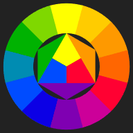
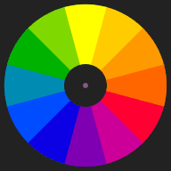
Strangely enough, most people, painters in particular, are not familiar with the principles of colour vision. Colour theory for artists often does not go beyond the misleading colour wheel and colour mixing scheme of Johannes Itten.
Figure 1: Itten's colour wheel and mixing scheme
|
|
Colours don't loose their charm if we know how we perceive them and how they are generated. On the contrary, they become even more fascinating.
The colour stimulus
Colour is carried by light, electromagnetic waves, but the sensation of colour is subject to many other influences, which makes its quantitative description difficult, to say the least.
For colour measurement, therefore, one uses "free colours" (or aperture colours), a structureless viewing field, and the only question is whether the two halves of the field are equal or not. This eliminates all additional clues we might get on the "true" colour of the object.
| | Figure 2: Two slightly different colours in adjacent halves of the viewing field |
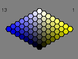
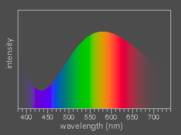
The light reaching the eye is called the colour stimulus. It is characterized by the spectral function which describes in physical terms its composition of radiation of different wavelengths.
Figure 3: The spectral function of a colour stimulus and the resulting colour in patches of decreasing lightness.
To determine the spectral function requires expensive apparatus (spectrophotometers). But for a rough impression of the composition of a specific stimulus, a simple glass prism will do, see the "observations with a prism".
How to characterize colours?
The spectral function contains all information on the colour stimulus, but how much of this do we recognize?
One characteristic feature is the brightness or lightness. Our visual system can adapt to a wide range of overall brightness (illumination level). The brightness of surface colours is maximum if all the incident light is remitted, this is ideal white. Real white pigments, like titanium dioxide TiO2, absorb few percent of the incident light, but the absorption is independent of the wavelength.
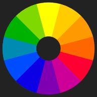
Next let us order the different hues. A child getting a box of colour pencils will do so, as many artists have done before. We take as an example the colour circle as proposed by Johannes Itten (1888–1967, swiss artist, teacher at the Bauhaus in Weimar, colour theorist).
| |
|
| Figure 4: Colour wheel after Johannes Itten. The arrangement reflects the artist's experience with the mixing of paints as well as his subjective choice of "pure" primary colours.
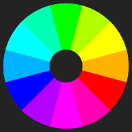
| | Figure 5: Another colour wheel which uses the primary colours of the display screen. The arrangement is such that diametrally opposite colours yield grey, when mixed with the spinning colour top (see below). Note that the steps from one field to the next are perceptionally quite unequal. (The colours are displayed with maximum brightness.) |
The colours pink, brown, grey, white and black (and others) do not fit into this ordering scheme. If these colours are to be included, a three-dimensional colour space is needed.
An overview over colour systems of historical interest can be found at www.colorsystem.com; here we skip the older schemes and only give some illustrative examples.
| |
Figure 6: A cross section through Wilhelm Ostwald's colour solid. It is conceived as a double cone with the colour circle at its circumference. The hues are numbered from 1 to 24; yellow has the number 1. Number 5 is red, 9 is purple (magenta), 13 is blue, 17 is blue-green (cyan), 21 is green, 24 is greenish yellow and the circle closes. For intermediate hues, the numbers are interpolated.
A double click on the image will start an animation showing a sequence of cross-sections; a single click stops the animation.
Click
HERE to see the amimation in a separate window!
|
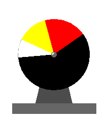
Wilhelm Ostwald (1853–1932, Nobel prize winner in chemistry) developed his colour atlas on the basis of mathematical considerations and measurements with the spinning colour top. A colour is characterized by the hue number and by its white-content W and black-content K.
W and K are easily determined with the spinning colour top.
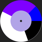 | |
Figure 7: Maxwell-disc colorimeter (colour top) made from four interlocking paper discs with radial slits. When the relative proportions of the sectors are appropriately chosen, the colours of the outer ring will mix to yield the colour of the inner disc when the top is spinning fast. Two neighbouring hues (number 12 and 13 in the picture) are chosen to match the hue of the specimen in the middle, and the black- and white-content can be obtained from the respective angles.
|
In Ostwald's colour scheme, colours opposite to each other can be mixed by the spinning colour wheel to yield grey, one says that the hues are complementary.
Albert Henry Munsell (1858–1918), an American painter, developped an ordering scheme in the beginning of the 20th century. He chose the three quantities hue, value, and chroma to specify colours. The hue is denoted by capital letters abbreviating the english name preceded by a number (from 1 to 10) to subdivide the hue's range. The value (=lightness) and chroma (=saturation, purity) are denoted by numbers, and the arrangement aimed at perceptionally equal steps of value and chroma for each hue. This leads to an irregular shape of the resulting colour solid (often called colour tree). The Munsell system has been very influential and successful until today.
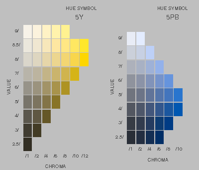 |
| Figure 8: Schematic reproduction of two pages from the Munsell Book of Color, showing the arrangement of colour samples. 5Y stands for mid-range yellow; 1Y is neighbouring 10YR (yellow-red = orange), while 10Y is neighbour to 1GY (green-yellow). PB means purple-blue. |
The Ostwald system was precursor to the DIN Colour Charts (DIN 6164), which retain the numbering of hues from 1 to 24, but being based on modern colorimetry and empirical rules for lightness and saturation, abandoned the simple geometrical shape of the colour solid. Colorimetry has also been employed to smooth irregularities of the original selection of samples of the Munsell atlas.
For special purposes, a number of colour systems or colour charts have been established: HKS, NCS, Pantone, RAL, and others, which shall not be discussed here.
The most important result which can be read off from all these ordering schemes is that three coordinates are needed to specify the position of a colour, which means that the colour solid containing all hues and shades is a three-dimensional body. If this seems obvious, it should be noted that there are other beings – birds as the best known example – which would not agree with this statement. Our visual system extracts three quantities from the information contained in the colour stimulus which may be used as coordinates in a three-dimensionan colour space, that of birds supplies four coordinates, while most mammals discriminate only two. For insects the range of visible light is not identical with ours in general, they do not see the same colours as we do. These experimental findings tell us that what we might assume to be the properties of colours are rather the properties of our visual system.
Optical illusions, colour constancy
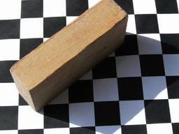 | |
Figure 9: A wooden block casting its shadow on a black and white checkered paper. The black fields in the upper left part of the photograph are actually lighter than the triangular visible parts of the white fields in the shadow which are partially covered by the block. Nevertheless, we perceive the former as black, the latter as white. Should this be called an optical illusion? We see that the white squares in the shadow are darker, and we see that they are white (see Adelson's checkershadow illusion).
|
As the illumination in general is not uniform, the perception of gradual changes in lightness is suppressed, while abrupt changes which in most cases are important for the perception of shapes, are enhanced ("contrast"). What is of interest, is the shape and the "true colour" of an object, where the vague notion of true colour may be defined as the colour seen under "normal" circumstances at daylight. The colour stimuli depend on the illumination and on the absorption properties of the things which we see. Their colour should not change when the illumination changes, and the visual system involves a lot of data processing to eliminate the influence of illumination on the perceived colour as much as possible.
The result of the data processing which is delivered to conscious perception is, so to say, the best guess of automatized (inconscious) evaluation routines on the shapes, colours, and distances of objects, which usually are quite reliable.
Estimated 40 % of the brain are involved in vision. After the stimuli received by the eye are transformed to neural activity, everything which is likely to be due to imperfections of the eye or otherwise identified as "junk" is filtered out and is not seen. We do not see the shadows of the blood vessels in the retina which the light has to pass before it reaches the sensitive layer containing the cones and rods. Every visual signal which stays constant when the eye is moving is suppressed.
Contrast
Contrast enhancement is strongest for abrupt changes of lightness – nice examples can be found in the internet, e.g. lightness demonstrations, while colour contrast is not so striking. But nevertheless, the colour produced by the same stimulus may even be named differently, depending on the surroundings:
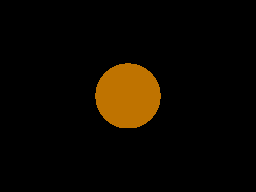
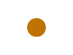
Figure 10 a, b: What before a dark background may still be perceived as orange, appears brown on a white background. Click on the pictures to enlarge them! The effect is seen most clearly if the enlarged image covers the whole screen (key F11).


Figure 11 a, b: It is almost impossible to correctly judge the relative lightnesses of separated areas (left). If the two halves of the picture are shifted so that the half-rings touch, one sees that they have the same colour. (This is a variant of the Koffka ring.)

Figure 12
Remitted light from the surroundings is part of the illumination. In a room with pink walls a white sheet of paper would be pinkish, but our visual system accounts for that by shifting the impression slightly towards the complementary colour (green in this case), so that the resulting impression is still "white". In the case of flat images, this shift may be considered an optical illusion. – The two squares are coloured with the same grey, but the left one appears to have a greenish hue, the right one looks slightly pink.
After-images (see below) also contribute to colour contrast.
Assimilation
Figure 13 | |
Understanding why and how contrast works, the assimilation of lightness and colours is surprising: In the picture to the left the coloured stripes appear darker behind the black pattern, lighter under the white one. This seems to be a side-effect of the way the optical data are processed before becoming sensations. In engineering jargon, one might say that lightness and colour information is transferred with less spatial resolution than the information on shape and structure.
|
Assimilation is even more impressive in colours, as the picture to the right shows. Only the four colours shown at the very right have been used.
Often the different manifestations of assimilation are given different names: the figure on the right is an example of Munker's illusion; if only shades of grey are used it would be called White's illusion, see e.g. the compilation of illusions by Kitaoka. | |
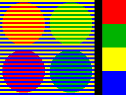
Figure 14
|
Afterimages
Long-lasting afterimages occur after being dazzled, they disappear and reappear when one closes the eyes, showing the "junk removal mechanisms" at work. They are explainable by bleaching of the visual pigments, fatigue and recovery. The afterimages appearing after looking at some colour for a while fade after few seconds and are due to adaptation, i.e. active adjustment of the relative sensitivities in the short, middle, and long wavelength regions.
Staring for a while at the center of the colour wheel below, and afterwards staring at the dark spot in the neighbouring white field, one will see the wheel in complementary colours (approximately).
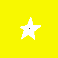
When staring at the black spot of the white star on yellow background, you should try to guess how the afterimage will look like.
 | 
| 
|
|
Figure 15 |
Figure 16 |
Figure 17 |
The Lilac Chaser
This very impressive illusion (discovered by Jeremy Hinton and made public by Michael Bach) derives from the combination of afterimages with the suppression of constant retinal images, and demonstrates the importance of the involuntary eye movements. Click on the picture to enlarge it!
Stare at the small + in the middle and try not to move your eyes for some 30 seconds. If you succeed, all the diffuse lilac patches will vanish and a light green patch will circle.
|
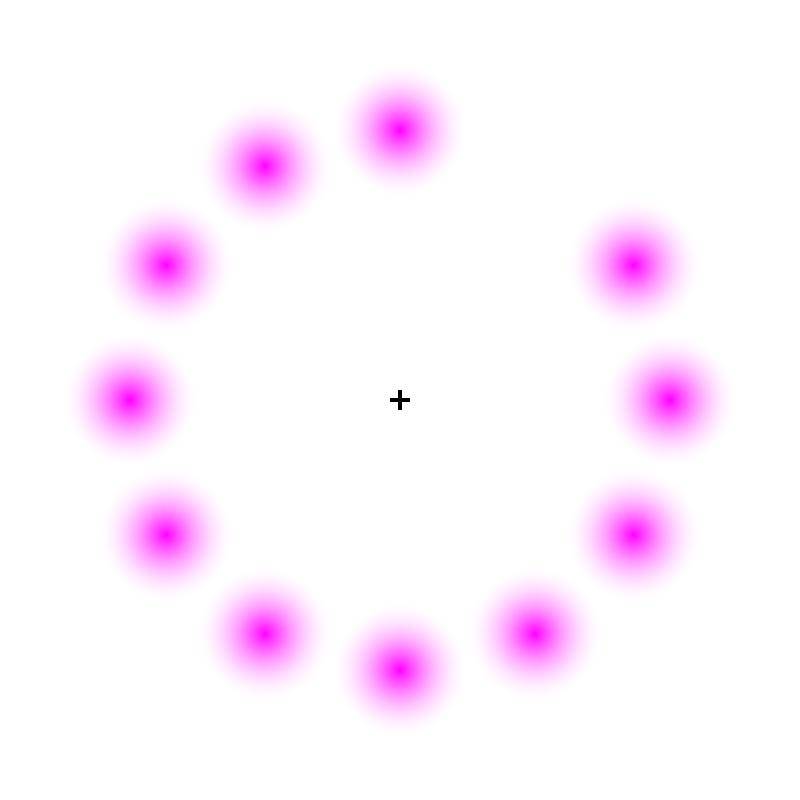 Figure 18
|
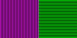
The McCollough-effect
This afterimage effect, found by Celeste McCollough (published in Science, 1965), cannot be explained by simple adaptation or even bleaching of the visual pigments. To see it, one first has to look at the green and purple stripes for 5–10 minutes (click on the image to enlarge it). Do not stare at a point, but let your eyes move freely over the lines. After that, when looking at the black-and-white striped pattern, you will see the white stripes faintly coloured, depending on their orientation (enlarge by clicking).
|
 |
|
Figure 19 |
Figure 20 |
It is remarkable that the effect is very persistent. After 24 hours, or even more, it can still be seen.
This selection of optical illusions should suffice to demonstrate that vision, colour vision in particular, is not a simple, one-step process, but involves a huge amount of data processing, and uses all clues which may be helpful to perceive the "true" colour (or lightness, or geometric shape). If these clues are artificially chosen to mislead perception, an optical illusion results. A catalogue of illusions is given on Kitaoka's site.
Historical notes
When Isaac Newton discovered the splitting of white light into a colourful spectrum (= spectre, apparition) in the second half of the seventeenth century, he assigned different refractive indices to the rays, depending on the different colours which they evoked. He investigated the addition of different colours (additive colour mixing), named seven distinctive hues in the spectrum but left it at an infinity of different hues, focusing his interest on optics.
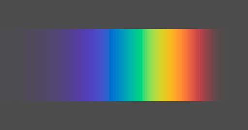 |
Figure 21: Spectrum as it might be seen in a not completely darkened room when a beam of sunlight is refracted by a prism.
|
During the 18th century, the opinion that light is made up of only three colours gained ground. In 1757 Mikhail Lomonosov suggested a "three-particle" model of colours. In 1786, George Palmer proposed an essentially correct explanation of colour vision – without public resonance (see: D.L. MacAdam, Journal of the Optical Society of America 60 (1970) p. 296):
The retina must be composed of three kinds of fibers, each susceptible of being stimulated by only one of the three primary rays. Equal sensibility of these three classes of fibers constitutes true vision; any deficiency of sensibility of any class constitutes false vision.
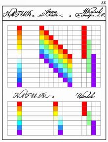
When Goethe polemized against Newton's explanation of prismatic colour, his contemporaries tried to explain to him how his observations can be understood in terms of Newton's variable index of refraction. Goethe himself added a table to his Theory of Colours (Farbenlehre) illustrating two of these explanations (which he rejected).
How does a white strip of paper on a dark background appear when seen through a prism? Green (in Halle/Saale) superposes the seven colours of the spectrum to produce the result, while Wünsch (in Frankfurt/Oder) uses only red, green, and violet (Ch. E. Wünsch, Versuch und Beobachtung über die Farbe des Lichts; Leipzig, Breitkopf 1792).
Figure 22: Table IX from Goethe's Theory of Colours (retouched)
|
|
In 1807 Thomas Young (1773–1829, English physician and scientist) published the final version of his theory of colour vision, assuming three kinds of receptors in the retina which, when only one of them is stimulated, yield the "simple sensations":
From three simple sensations, with their combinations, we obtain seven primitive distinctions of colours; but the different proportions, in which they may be combined, afford a variety of tints beyond all calculations. The three simple sensations being red, green, and violet, the three binary combinations are yellow, consisting of red and green; crimson, of red and violet; and blue, of green and violet; and the seventh in order is white light, composed of all three united.
(A Course of Lectures on Natural Philosophy and the Mechanical Arts. Johnson, London 1807. Digitized volume, p. 440)
(1802, in his first attempt to explain colour vision, Young had named yellow instead of green and blue instead of violet as simple sensations. Source, p. 21)
By interference experiments, Young had also discovered the wave-nature of light, and accordingly he named the sensitive elements "resonators", and he postulated three different resonance frequencies.
Young's theory has been further worked out and corroborated by Hermann von Helmholtz (1821–1894) and James Clerk Maxwell (1831–1879), and has since then been supported by a wealth of experimental data.
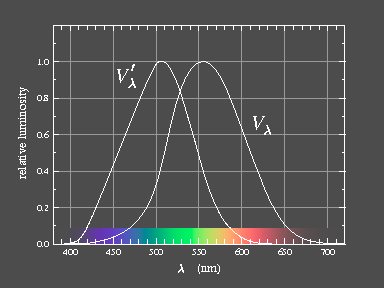
In the retina, there are two different types of photoreceptors, the rods and the cones. The rods are active at very low illumination levels (scotopic vision, night vision) and do not discriminate colours. They are inactive at higher levels of illumination which is the domain of the cones (photopic vision). It is remarkable that the judgement of lightness under scotopic conditions is different from that under bright light. This effect has first been described by Purkinje (...). The sensitivity of the rods is highest for wavelengths around 500 nm, that of the cones slightly above 550 nm.
| 
| Figure 23: Relative sensitivity as a function of wavelength: V'λ is for scotopic (night), Vλ for photopic (daylight) vision.
|
Theory of colour vision
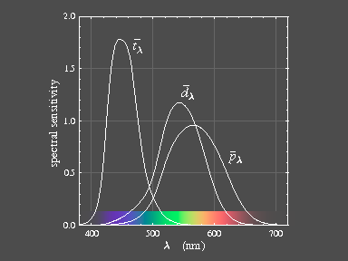
There are three kinds of cones in the human retina. The cones are hosting Young's resonators – the visual pigments. Those which are sensitive for the longest visible wavelengths are called L-cones or p-cones (L for long wavelength or p from greek proton, "the first"), those with maximum sensitivity in the middle range are called M- or d-cones (deuteron = "the second"), and the third ones are called S- or t-cones. The spectral sensitivity curves are shown in figure 23 below.
Three kinds of cones supply three primary colours, therefore human colour vision is said to be trichromatic. It is known that birds and also marsupials have tetrachromatic vision i.e. they have four different cone pigments, while most mammals are dichromats, having only two. A small percentage of humans also has only dichromatic vision, lacking the L- (protanopia), M- (deuteranopia), or (very seldom) the S-cones' pigment (tritanopia).
 |
|
Figure 24: Average sensitivity curves of the L- (p), M- (d), and S- (t) colour receptor systems.
The 1931-CIE colour matching functions supplemented by data on colour deficient persons have been used to generate the functions. Individual sensitivity curves may be slightly different, but the general appearance is always the same.
|
It is remarkable that the L-cones which supply the "simple sensation red" are most sensitive for wavelengths which are seen yellow. There is a large overlap of the L- (p) and M- (d) curves, while the S- (t) curve has only small overlap with the other two.
The retina looks pink because of the visual purple (rhodopsine) which is the pigment of scotopic vision. It consists of the chromophore retinal bound to a large protein molecule named opsine. The absorption curve of visual purple agrees well with the scotopic sensitivity curve V'λ (taking into account that the yellow pigmentation of the lens and the macula act like filters on the incoming light). The cone pigments have been measured only much later. It seems that they all are closely related to rhodopsine, and the molecular surrounding by the opsin to which the retinal is bound is different from that of rhodopsine and shifts the absorption to the appropriate position.
Assuming that the evolutionary process of variation and selection has worked to optimize the relative positions of the sensitivity curves, one may ask why it is advantageous that the L- and the M-sensitivities overlap so much. ...
There is indeed an answer to that question, and it is related to an other remarkable fact which we discuss first. We have noticed that the colours in the colour wheel are very unequal in their brightness. Pure blue is much darker than pure green, red or yellow. Looking at the spectrum of white light, the short-wave (violet-blue) region is very dim. Though we see the blue-violet, there is almost no brightness associated with it. This is remarkable, for the short-wave light by itself is not weak at all, in fact, the corresponding photons are the most energetic ones!
For objectives of photographic cameras, combinations of lenses made from glasses differing in the amount of dispersion are used to reduce the overall dispersion effects (achromatic lenses). With the substances making up the optical system of the eye – proteins and water – it has not been possible to evolve an achromatic lens. In the human eye, the difference in refractive power of the cornea–lens combination
for light of 550 nm (overall maximum sensitivity) and 450 nm (maximum sensitivity of S-cones) amounts to 1 diopter! This means that the eye cannot simultaneously focus "red", "green", and "blue" light. If the S-cones would contribute significantly to the brightness sensation, this would reduce visual acuity. The sensation of brightness is derived from the L- and M-cones, therefore, for good visual acuity, their sensitivities should be not too different.
Experimental facts
Modern methods of experimental biology have brought great progress to our knowledge of the visual system, see the review "Webvision" edited by Helga Kolb, Eduardo Fernandez, Ralph Nelson and Bryan Jones. In particular, the distribution of rods and cones in the retina could be determined. The S-cones are the least frequent – in the foveal pit only 3–5 %, at the foveal slope about 15 % and elsewhere in the retina about 8 %. In most cases the number of L-cones exceeds that of the M-cones (roughly 2:1), but the variation among individuals is large (see Fig. 19 in the section Photoreceptors and Fig. 21 in the section on Color Vision).
When do we see which colour?

Figure 25
| Idealized schematic remission curves of a blue, green and red surface. If only the short wavelengths are strongly remitted (blue line), the S-receptors are stimulated strongly and the M-receptors only weakly, and the resulting sensation is "blue". The primary sensations "green" and "red" arise when the stimulation of the M- or L-cones, respectively, strongly exceeds that of the other ones.
|
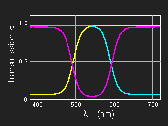
Figure 26
|
Idealized transmission curves of layers of inks as used for colour printing (or remission curves of white paper with yellow, magenta or cyan ink on it). The yellow ink absorbs strongly the short waves and lets middle and long waves pass, magenta absorbs most strongly in the middle range and cyan in the long-wavelength region. Yellow is, so to say, white minus blue, magenta is white minus green, and cyan is white minus red.
|
Colour mixing
From the fact that there are three different kinds of cone pigments follows the three-dimensionality of our colour space. If it were possible to stimulate each kind of cones separately, all possible colour sensations could be produced. This is not the case, but with three suitably chosen light sources, most colours which can be seen in our environment can be fairly well reproduced.
Additive colour mixing
Superposing "coloured" light from different sources is called additive mixing. It is governed by simple laws following naturally from colour vision. The results are, however, quite different from the common experience of mixing substantial colours (colorants, i.e. pigments or dyes).
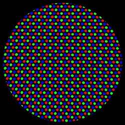
Figure 27 | |
Grey area on a computer screen (cathode ray tube) photographed through a strong magnifying glass. The coloured dots are so small that under normal viewing conditions they cannot be discriminated. There are only red, green, and blue dots to produce all colours which can be displayed on the screen. |
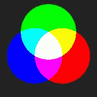
Figure 28
| |
Scheme of additive colour mixture. With three projectors and red, green, and blue filters this impressive mixing scheme can be demonstrated as a classroom experiment. When seen for the first time, this experiment is a surprise. Perceptionally, we never realize that yellow is green plus red, as the impression yellow is completely different from red and green. The other two binary additive mixtures, cyan and purple (magenta), are not so different from their components.
|
Mixing by averaging
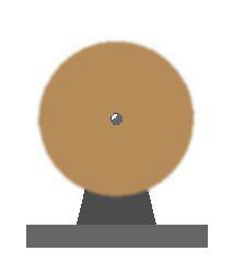
Every visual impression takes some time to build up and takes some time to decay. This fact is the basis of motion pictures consisting of rapid successions of frames. We have already mentioned the rotating colour top as a means of analyzing surface colours. If the rotation is fast enough, we see the average colour of the different sectors of the disc.
Figure 29 a, b: colour top at rest and spinning
Mixing by averaging also occurs if alternating differently coloured regions are so small that they cannot be resolved by the eye any more. In normal printing, grey is obtained by printing a black raster on the white paper.
Figure 30: Grey printed area seen through a magnifying glass
Mixing red and green by averaging, one cannot obtain yellow, as yellow would have to be brighter than red and green, but the brightness of the mixture is just the average of red and green. The resulting colour is olive-green, which can also be obtained by mixing yellow and black.
Subtractive colour mixing
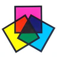
Figure 31
| |
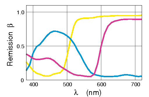
Figure 32
|
With colour filters the most important rules of "subtractive colour mixing" can be demonstrated (figure 31). Cyan suppresses the long wavelengths (red) and lets the others pass, the yellow filter suppresses only the short wavelengths, and a behind combination of both, only the middle region remains strong which is seen green.
In photographic film (colour slides), there are three layers which in the final stage of development are coloured by one dye each. To get the widest possible gamut of colours, the three dyes must be the colours cyan, magenta and yellow.
In four-colour printing one uses cyan, magenta, and yellow inks. Figure 32 shows the remission curves of real printing inks printed on white paper. If all three are printed on top of each other, however, no good black results. Therefore, black ink (K, Key) is used to increase the brillance of the prints.
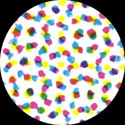
It is, however, not strictly subtractive mixing which occurs in three- or four-colour printing. Looking through a magnifying glass at a light grey area produced with this technique, one will see many dots of the inks with only very little overlap with their neighbours. All the colours of figure 31 (including white) may be present with different weights, and as the eye does not resolve the raster patterns, they are mixed by averaging.
Figure 33: A light grey area in four-colour printing as seen through a microscope. | |
 |
Mixing of paints
The results of mixing paints (made of pigments or dyes) in many cases are similar to subtractive mixing.
However, the exact result depends on a number of other factors in addition to colour – e.g. on the distribution of grain sizes in both components, the degree of transparency of the grains – so that alone from the colour of the components the result cannot be predicted precisely, if the other influences are not under control.
Mixing paints which are not close to each other on the colour wheel thus may yield very different results – blue and yellow paints might yield a deep green or a greenish grey only – but this is rather of little practical importance, as artists prefer to use adjacent hues for mixing, and in addition black and white. If only colours are mixed which are adjacent on a colour circle like figure 34, the difference between paint mixing and mixing by averaging is not very pronounced any more. The artist's palette is not (and should not be) restricted to colours which can be mixed from three primaries. |
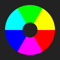
Figure 34
|
Primary colours, pure (unique) colours
Cone primaries
Thomas Young's simple sensations, George Palmer's primary rays nowadays are named the cone primaries, the colours associated with the stimulation of a single class of cones. Looking at a spectrum of white light (the reflection of the tungsten filament of a clear incandescent lamp in a CD), we see at one end the blue-violet of the cone primary and at the other end where the brightness begins to fade the red primary. The M-cones are almost never excited alone. The green cone primary should be the hue seen at approximately 500–520 nm (see the spectrum displayed in figure 23), but more saturated, so to say not a bit whitish.
Anyhow, if the stimulation of one kind of receptors greatly exceeds that of the other ones, the sensation will be close to that of the cone primaries.


| Figure 35: Hues of the cone primaries
|
Unique hues
Among the perceived colours, some are felt to be more fundamental than others. These are, so to say, psychological primaries, or unique hues. Generally, red, yellow and blue are named as fundamental sensations, in most cases also green. Different people agree remarkably well in their selection of unique yellow. Unique red, green, and blue shows some more variation.
While unique red may be considered to be the colour closest to the L-cone primary, unique green accordingly closest to the M-cone primary, unique blue is different from the S-cone primary which is blue-violet. And there is no cone-primary corresponding to yellow.


| Figure 36: The unique hues (unique green cannot be rendered well on the screen). |

 | Figure 37: Black and white are unique sensations too. |
That there are unique hues which are not corresponding to the cone primaries is evidence
for the fact that colour vision is not a simple one-step process. The optical data get transformed before they are perceived consciously.
Colour mixing primaries
When colours are to be reproduced by mixing some primaries in a technological process, it is important to use as few primaries as possible. From the fact that our colour-space is three-dimensional it follows that three is the minimum number if a realistic reproduction is aimed at. When additive mixture is possible as in TV, on computer screens or in theatre stage illumination, a wide gamut of colours can be obtained when red, yellowish green, and blue or violet-blue are the primaries. This will be treated in more detail in the later sections. Here we only stress that the choice of additive primaries is not unique; other properties than the colour of the phosphors for cathode ray tubes also played a role in the choice. For colorimetry, spectral lines of 700 nm, 546,1 nm, 435,8 nm
are used as additive primaries which yield a larger gamut.


 | Figure 38: The additive primaries R, G, and B for computer screens (sRGB). The TV primaries (SMPTE and PAL/SECAM) are very similar. |
| | |


| Figure 39: Approximate representation of the optimal subtractive primaries C, M, Y (cyan, magenta and yellow).
|
Artists' colour schemes
The artist's palette is not (and should not be) restricted to colours which can be mixed from three primaries. Nevertheless, artists explore the space of colours by mixing paints, and this experience guided them in developping colour ordering systems. We discuss as an example Johannes Itten's colour wheel which has been very influential. (For its predecessors see the article in Wikipedia).
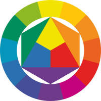
Figure 40: Colour wheel with mixing scheme after Itten
|
In Itten's colour wheel, green which is one of the "fundamental sensations" (cone primaries) appears only as a mixture (secondary colour). The unique hues red, yellow, and blue are used as primaries for mixing paints – but these are, as we now know, not the best choice yielding the largest gamut of mixed colours. As a consequence, purple, violet, and also green are obtained in rather dull shades. On the other hand, the steps from one hue to the next one are of fairly equal size, in contrast to the wheel shown in figure 5 which starts from the mixing primaries discussed above.
Itten's colour scheme is, so to say, a hybrid construction based on psychology (unique hues) and material properties (mixing properties of paints, which are complicated). Exaggerating only slightly, one might say that it does not do justice to colour vision, nor to the full power of colorant mixing.
|
In modern and contemporary art, red, yellow and blue still play a dominant role (while green is nearly missing), see e.g. the compositions painted after 1920 of Piet Mondrian (1872–1944), using only unique red, yellow, blue, and white and black, or the well-known four paintings of
Barnett Newman (1905–1970) "Who's Afraid of Red, Yellow and Blue" (II, IV).
Psychological issues
Nobody will deny that we are influenced by the colours which surround us. This can be observed with the general illumination which affects the appearance of everything around us, and our mood, too. The difference between sunny and gloomy weather, a room without sunlight and one with windows to the south.
But also coloured surfaces may affect us, if they have sufficient weight, as e.g.
wallpapers, furniture, tapestry, and clothing.
The red colour attracts much more attention than green does. Green is calming, red is stimulating or irritating – many authors have discussed the psychical action of colours, and they all agree on that.
Goethe in his Colour Theory (Farbenlehre) names a "plus-side" and a "minus-side" of the colour circle. The colours of the plus side are yellow, red-yellow (orange), red (minium, cinnabar). They stimulate and vitalize [764. Die Farben von der Plusseite sind Gelb, Rotgelb (Orange) und Gelbrot (Mennig, Zinnober). Sie stimmen regsam, lebhaft, strebend.]
The colours of the minus-side are blue, violet, and purple. They induce restless, soft, and longing (nostalgic) feeling.
[777. Die Farben von der Minusseite sind Blau, Rotblau und Blaurot. Sie stimmen zu einer unruhigen, weichen und sehnenden Empfindung.]
Green: Our eye finds therein a real appeasement ... Therefore for rooms where one always stays, green colour of the wallpaper is mostly chosen.[802. Unser Auge findet in derselben eine reale Befriedigung ... Deswegen für Zimmer, in denen man sich immer befindet, die grüne Farbe zur Tapete meist gewählt wird.]
Psychologists have investigated somatic effects when exposing persons to colour, artists (as Wassily Kandinsky, 1866–1944) have described the properties of colours, colour consultants (as Faber Birren, 1900–1988, American) have investigated how the colour of packing material or wrapping influences potential buyers ...
This shall not be treated in detail here. We only want to answer the question, why evolution associated certain feelings or even somatic reactions with some colours.
Prehistoric life
The influence of colours seems to be fairly independent of race and culture, as ethnological studies have shown. Therefore we assume that the almost reflex-like reactions are not caused by the flood of today's impressions, but have evolved at times when an adequate reaction to some colours was advantageous for life and survival.
Therefore, let us direct attention to prehistoric times and to the times before, when colour vision evolved in the precursors of the hominids.
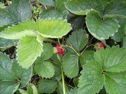
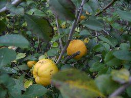
When gathering berries or other ripe fruit, it is definitely advantageous to perceive red, orange and yellow as vivid and stimulating, while it would be disadvantageous if every green leaf would arouse attention.
There is also good reason that our reaction on red is stronger than that on orange or yellow: red is the colour of blood. When hunting or fighting – the red colour of blood is seen in stress situations. This stress component is absent in orange and yellow.
A colour stimulus which is seen green, when of low intensity ("mixed with black"), is seen dark green, and similarly dark blue is still seen as blue. This is different with orange and yellow. There is no dark orange – the sensation is quite different, brown. There is good reason for that too: while an orange fruit is likely to be ripe, a brown one is more likely to be rotten. This makes a big difference, and therefore it is advantageous to see the difference already at the level of the colour sensation. It is better not to be attracted by brown. (There is no dark yellow either, we see olive green instead.)
Red, orange , and yellow are seen in fire and glow, sunlight is yellowish white, these colours appear warm; the colours of water, ice, the blue sky look cold.
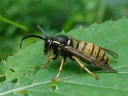
Alternating yellow and black stripes are used for warning – black-and yellow striped indicates that there is some danger. It is better not to touch black and yellow striped insects.
Back to the page "Seeing, measuring and rendering colour"
Legal Information Data Privacy
)
)
)
)
)
)
)
)
)
)
)
)