The spectrum of visible light
The html formatting and custom instructions have been disabled on this server. The same file with adapted formatting can be found here: https://farbeinf.de/static_html/whitelight.html.
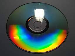
| The spectrum of the sun is hardly ever to be seen without suitable apparatus "in nature". Today everybody knows the colours seen on compact discs, and looking at the light of an incandescent lamp mirrored by a CD, one can see the mirror image of the lamp and, at different angles, the spectral decomposition of its light.
| 
|
In former times, only under very special conditions this could be observed – if e.g. in a dark room a beam of sunlight fell on a piece of cut glass and produced a multicoloured strip at the wall, a (strange) spectre in the original meaning of the word. First perhaps incidentally observed, the conditions were then refined by Isaac Newton using glass prisms. Newton described the phenomenon and explained it by differently strong refraction of the different colours of light. But only William Hyde Wollaston (1804) and independently Joseph Fraunhofer (1814) developed the experimental assembly so far that they could see then also unexpectedly fine details in the solar spectrum: Absorption lines, the wavelengths of which could be measured by Fraunhofer and which afterwards were named after him.
| The sun's spectrum with Fraunhofer lines. Image taken from a postal stamp honouring Fraunhofer's 200th birthday. | |
 |
You may find in the internet suppliers of inexpensive kits to build a hand spectroscope; material like diffraction gratings, prisms, lenses you may find there, as well as advice how to build a spectroscope.
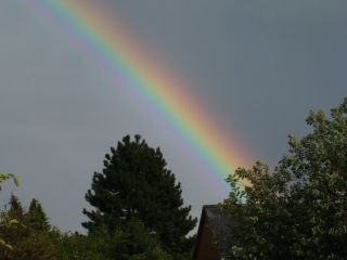
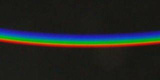
| The colours of the rainbow exhibit some similarity with the spectrum, but they are far from being spectral colours, not only because there is no dark background. |
|
Pictures which are to show how the spectrum of light looks, may be found in books and also in the Internet (an example from many: Dan Bruton's site), – rarely it is said that this is to be understood at best roughly qualitatively, because pure spectral colours cannot be rendered in print and on the screen. This is shown by the following illustration:
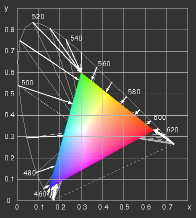
The CIE x y diagram with the range representable on an
sRGB-screen ("gamut") and the line of spectral colours. Two possibilities are illustrated, how they can be projected on the edge of the triangle. The grey lines connect spectral colours with points of the same hue of the gamut, the arrows point to the colours, which result, if the negative values of R, G or B are set equal to zero and the positive ones are retained. The results are confronted in the next picture.
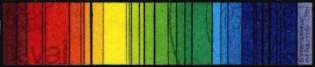
How does a spectrum look?
The representation of the "spectral colours" is a hard test for every method of rendition of coloured pictures, for printing, colour film, cathode ray tubes (colour television and computer screens) and in particular also the flat screens. (The reason for the irregularities and stripes seen on some TFT screens in the following picture, I have up to now not found out. On a cathode ray tube monitor they do not arise.)
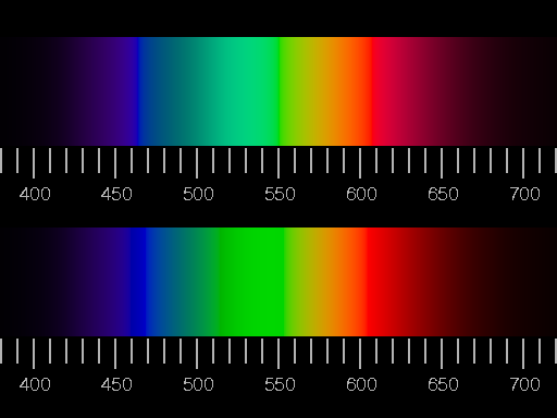
Confrontation of two illustrations of the visible spectrum (corresponding to a glowing body of 6000K). Colour and relative brightness were adapted as exactly as possible in the upper picture, i.e. white light was added, until the edge of the gamut was reached, and then the brightness was adjusted to that of the real spectrum. In the lower half of the picture, negative values of R, G, B were set to zero and the brightness readjusted.
Largest R, G or B-values arising in the picture may not exceed the maximum value of 1, thus the brightness is limited.
Where is the yellow light?
First it is noticed that
in both variants there is no real yellow. What is between red and green looks like greenish orange or orange-green. That sounds strange, but look at it! The correct designation of the colour is olive.
| Looking through a prism at a narrow white strip on a dark background, the white (light) is seen decomposed into colours; however, one does not see seven distinct colours as might be expected, but rather only three, namely red, green, and violet-blue, as has already been noticed by Goethe. |
 |
Also with a spectroscope one does not see yellow in a spectrum of low intensity. Indeed, the spectrum does not appear particularly colourful when it is dim; red, green and violet-blue, with the mentioned "discoloured" transition between red and green. Only with sufficient brightness finest colour gradations become visible and the spectrum displays its whole splendour. Then it has also a yellow part. The dependence of the perceived colour on the brightness is known since the 19th century under the name of Bezold Brücke shift.
A further, similar effect is the shift of the perceived colour when white (light) is added (Abney effect). This is not yet disturbing in the small image shown above; but in the large original (you find its PostScript source code here) the dark "rose-pink" corresponds much less to what one sees at the red end of the spectrum than the red in the lower part.
The simulation of the spectrum shown in the upper half of the picture is to a certain extent the optimum of the attainable realism, if as faithful a rendition of colour and brightness as possible is aimed at. The "absence" of yellow is not to be repaired, as long as the brightness corresponds to reality. The physiological colour yellow is brighter than red and green, in the continuous spectrum, however, the brightness at the wavelengths from 570 to 580 nm is always close to those of the neighbouring colours. There is no really satisfying rendition of the spectrum on the screen or in print.
The simulation shown in the lower half shows more saturated colours, but clear hue falsifications: unique green, neither blueish nor yellowish, should be seen at the wavelength of 530 nm, but instead there is the yellowish green of the green phosphor.
The problem addressed here is presented in more detail and carefully discussed by Andrew T. Young. You find there also a compromise between realism and good appearance of yellow.
Historical
Isaak Newton discovered and described the decomposability of sunlight in 1666 and lists the seven colours that appear: red, orange, yellow, green, blue, indigo, and violet. However, from this enumerating one can already conclude that Newton's experimental arrangement was quite simple: a not too small opening in the blinds used to darken the room through which a beam of sunlight passed, a prism and, at some distance from it, a screen, perhaps a white sheet of paper. The observed "spectrum" could have looked about the same as the image on the right, but with a darker background.
Right: a spot of light thrown onto the wall by a facet of a cut glass.
If Newton had seen the spectrum as it has been shown further above, then he would have needed only three colours to describe it: red, green, and indigo, or four colours if he had included orange.
It may appear strange that among the colours of the spectrum indigo is named – this sounds like a doubling of blue. But most likely Newton meant with "blue" a sky-blue, similar to the colour which today in printing technology is usually called cyan. Synthetic indigo is used for colouring blue jeans – everyone knows their colour, blue, as the name already says. In today's manner of speaking we would call the seven colours in the light red, orange, yellow, green, cyan, blue, and violet.
The fundamental primary colours
The appearance of a dim spectrum – red, green and violet-blue – is naturally due to the characteristics of the receptors in the retina: the fundamental primary colours (or cone primaries) correspond to stimulation of only one of the three kinds of cones. These colours are seen in the upper field of the spectrum comparison at 630 nm, 520 nm and 450 nm. The red of modern traffic lights (as seen on a bright day) corresponds in good approximation to the physiological basic colour, which some authors like to call orange-red. In the dark the sensitivity of the cones rises, then the green-sensitive ones are already noticeably stimulated by the red light, thus the colour perception shifts towards yellowish red (Bezold Brücke shift). With a digital camera it is by the way similar:
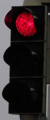
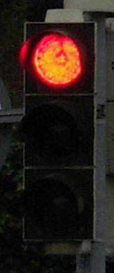
Left: On a bright day and against the bright sky the red light of a traffic light appears as a pure, saturated red. Right: At dawn against a dark background and at night the same red light appears yellowish.
Aesthetic criteria
We end this section with quotation from the interesting Internet site of Philip Laven, which is concerned with the optics of water drops – applying the theory of Mie to rainbows, glories and related phenomena. In the programs for the computation of these phenomena, to get the colour coordinates for the representation on the screen, Laven uses the very naive procedure from Dan Bruton's site and writes "The Bruton algorithm is obviously a simplification of a complex process. More complex algorithms have been investigated, such as those developed by CIE (Commission Internationale Eclairage – International Lighting Commission) but none of them produce an aesthetically pleasing spectrum!"
The fact that an optimally computed spectrum does not look as beautiful as expected, has been the cause to use a wrong procedure which supposedly yields "more beautiful" results. It is a pity. Whereas a faithful rendering of spectral colours is impossible, the rainbow colours can be reproduced exactly on the screen, of course using the CIE data! The moral of the story is: do not blindly rely on aesthetic criteria!
Back to “Seeing, measuring, and rendering colours”
or to the page “the origins of colour”
)
)
)
